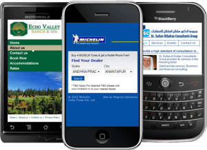
According to a study by Nielsen Media Research, mobile Internet usage is growing at a rate of 30 percent each year. With more people surfing the Web using their smart phones, businesses must recognize the need for their websites to be compatible with these devices. By creating a separate site for mobile users, you are enabling them to experience faster browsing speeds, easy navigation and an overall improved user experience. Having a mobile website can also provide strong search engine optimization (SEO) benefits since it will boost your rankings on mobile-friendly search engines, such as Google and Yahoo.
This article will explain why your business needs a mobile website, what your mobile website should look like and how you can convert your existing website into a mobile site.
Why Does Your Business Need a Mobile Website? — With the variety of mobile devices to choose from, such as iPhones, iPads and Androids, the mobile Web is rapidly replacing traditional desktop browsers. As an increasing amount of people use smart phones to browse websites, businesses should not hesitate to reach this important mobile audience. Traditional websites don’t work well for mobile users because they don’t render correctly on the small, high-resolution screens of smart phones, causing sluggish browsing speeds and disfigured navigation schemes.
Having a mobile website will also provide your business with valuable SEO benefits. Since Google has a separate index for mobile content, having a mobile website is key to securing a higher ranking when people search on Google using their smart phones. Another benefit is that, since Google has a much smaller mobile index of content and not as many businesses have mobile websites, those who do have mobile sites will be at a significant advantage.
What Should Your Mobile Website Look Like? — Most websites were designed to be viewed on a desktop monitor, which has much more space for displaying text and images. For mobile websites, it is essential to have a much simpler and less text-heavy design and navigation scheme. It is also essential to reduce bandwidth so that your mobile site will load faster and run smoother on smart phones. When designing a mobile website, it is important to prioritize your content and navigation scheme and only present the information that is most relevant to mobile users. For example, phone numbers, maps and directions should be easily accessible on your mobile website because these features are valuable to mobile users. A useful feature for mobile Web browsers is the “click to call” option. This feature allows users to automatically call the business by simply clicking on the phone number.
If you are interested in creating a mobile website for your business, please contact The Public Relations and Marketing Group at (631) 207-1057 or johnzaher@theprmg.com. You can also visit our blog for more valuable articles, advertising spotlights and more.


